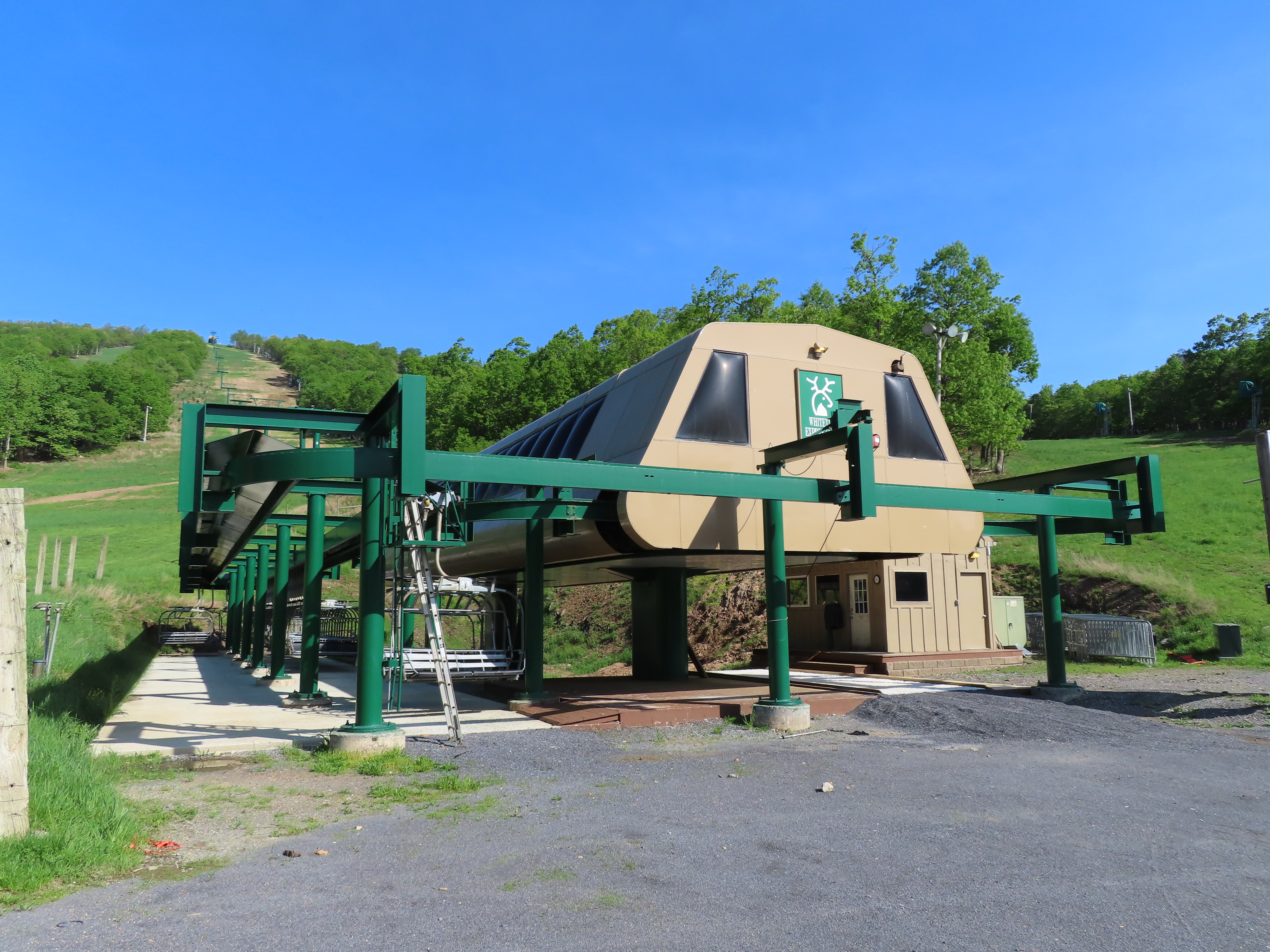
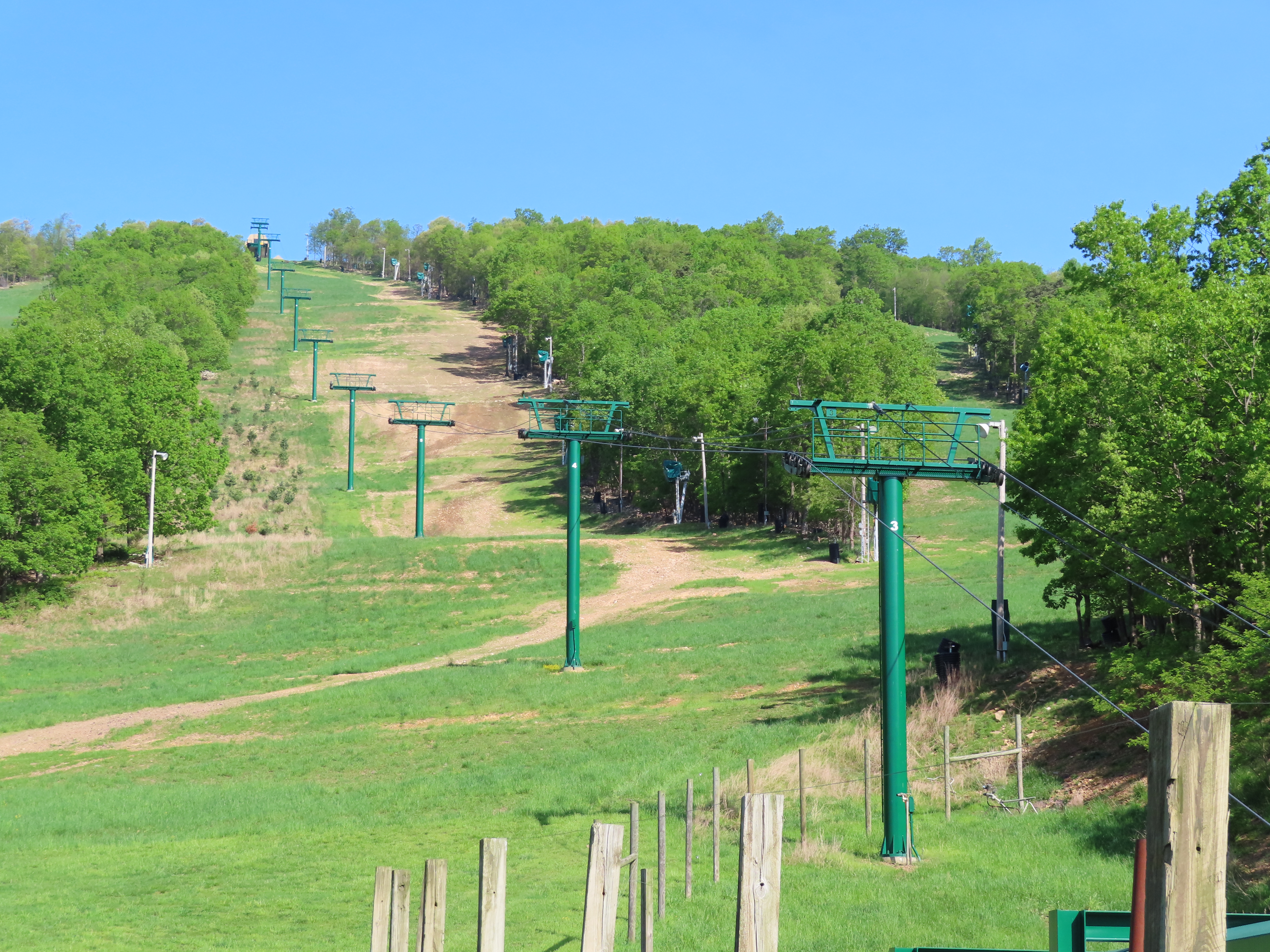
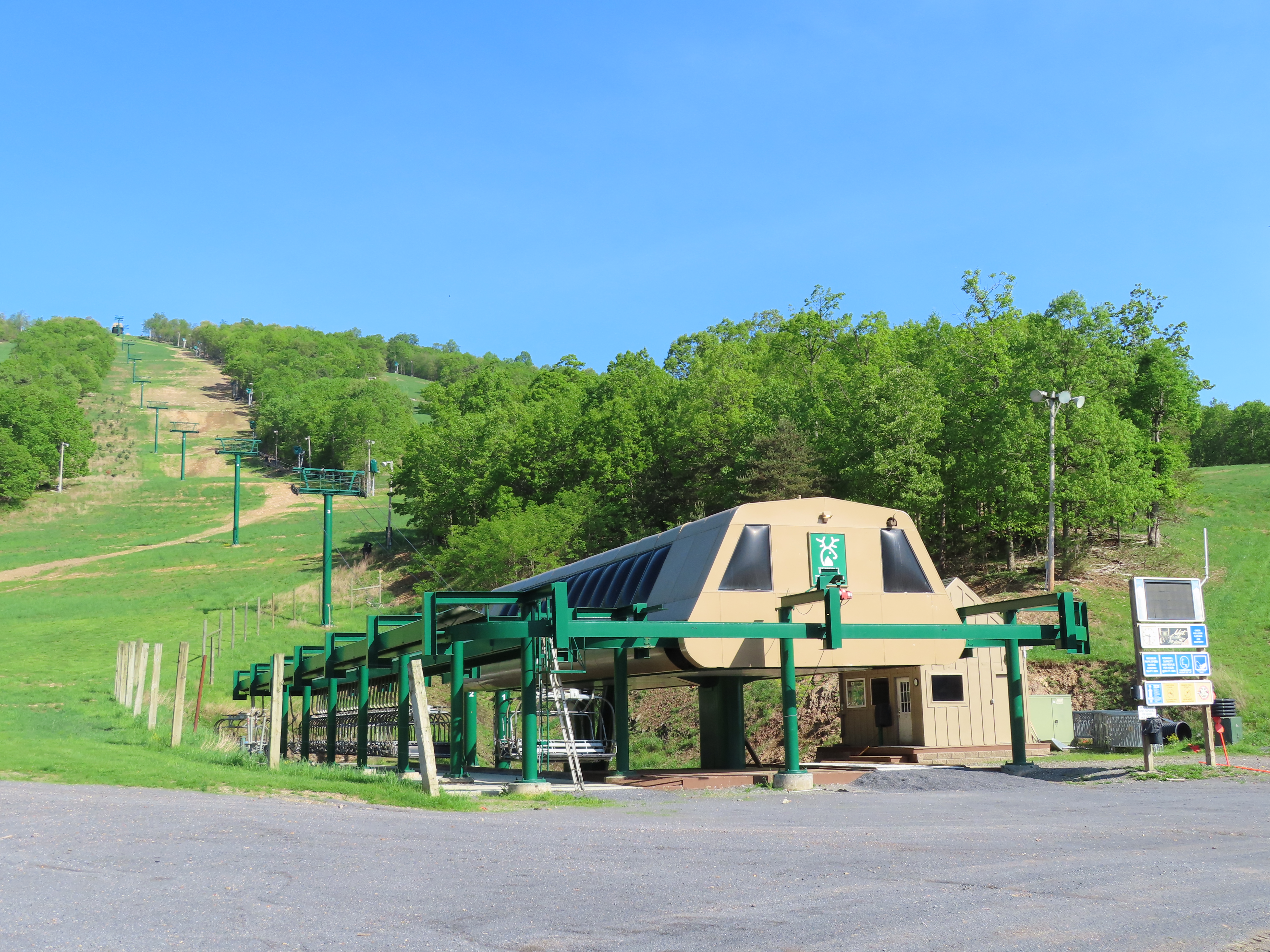
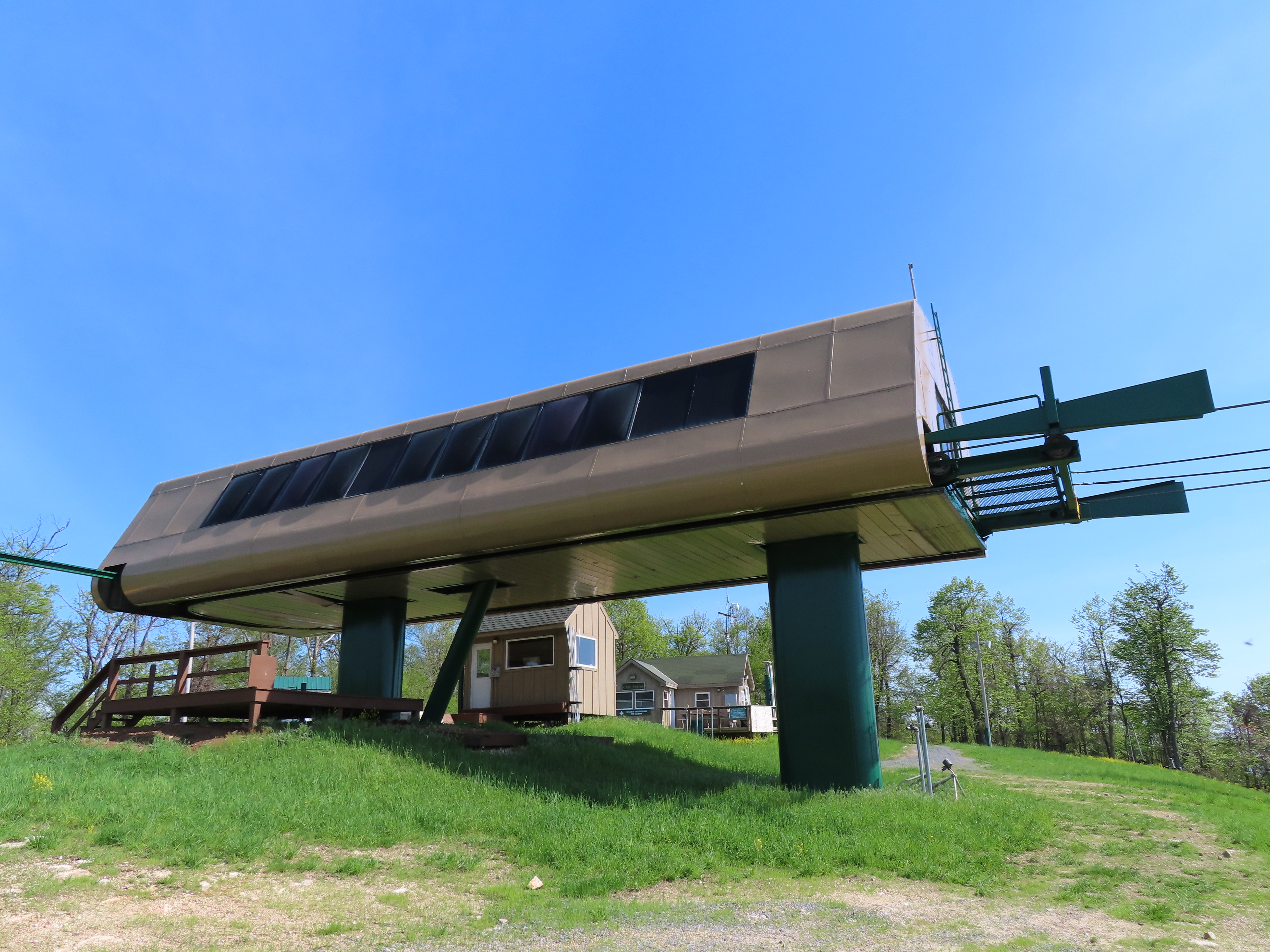
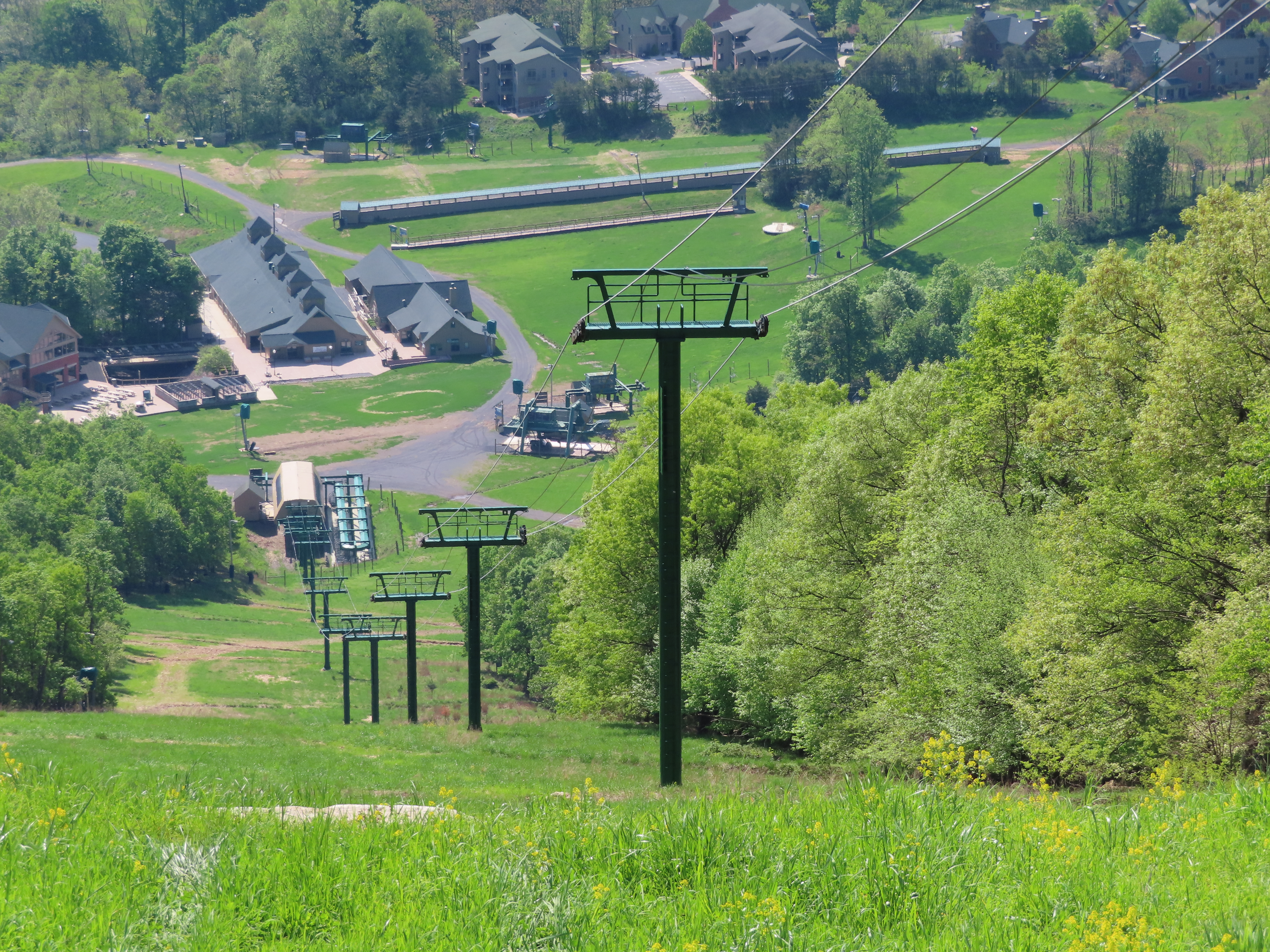
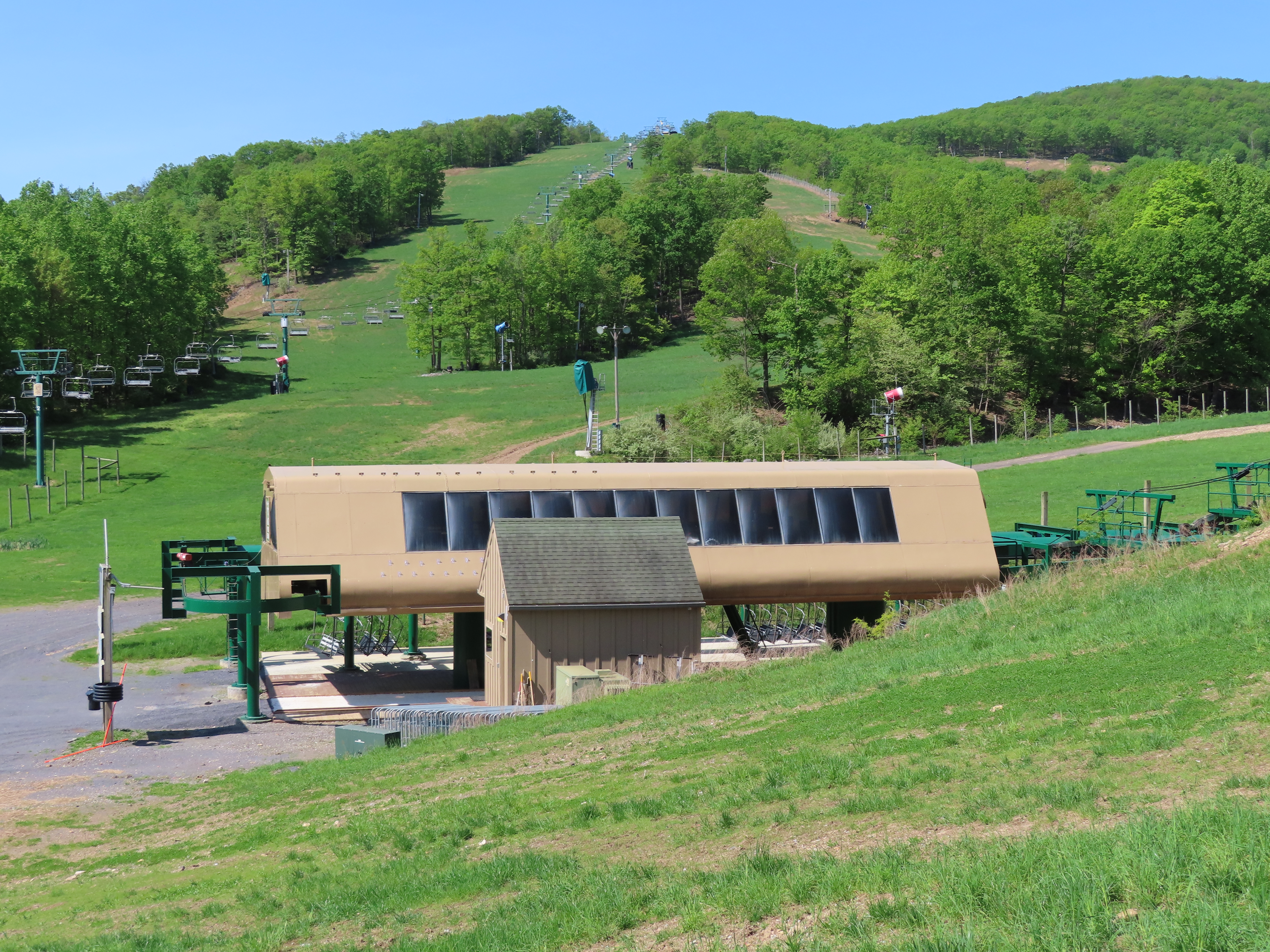
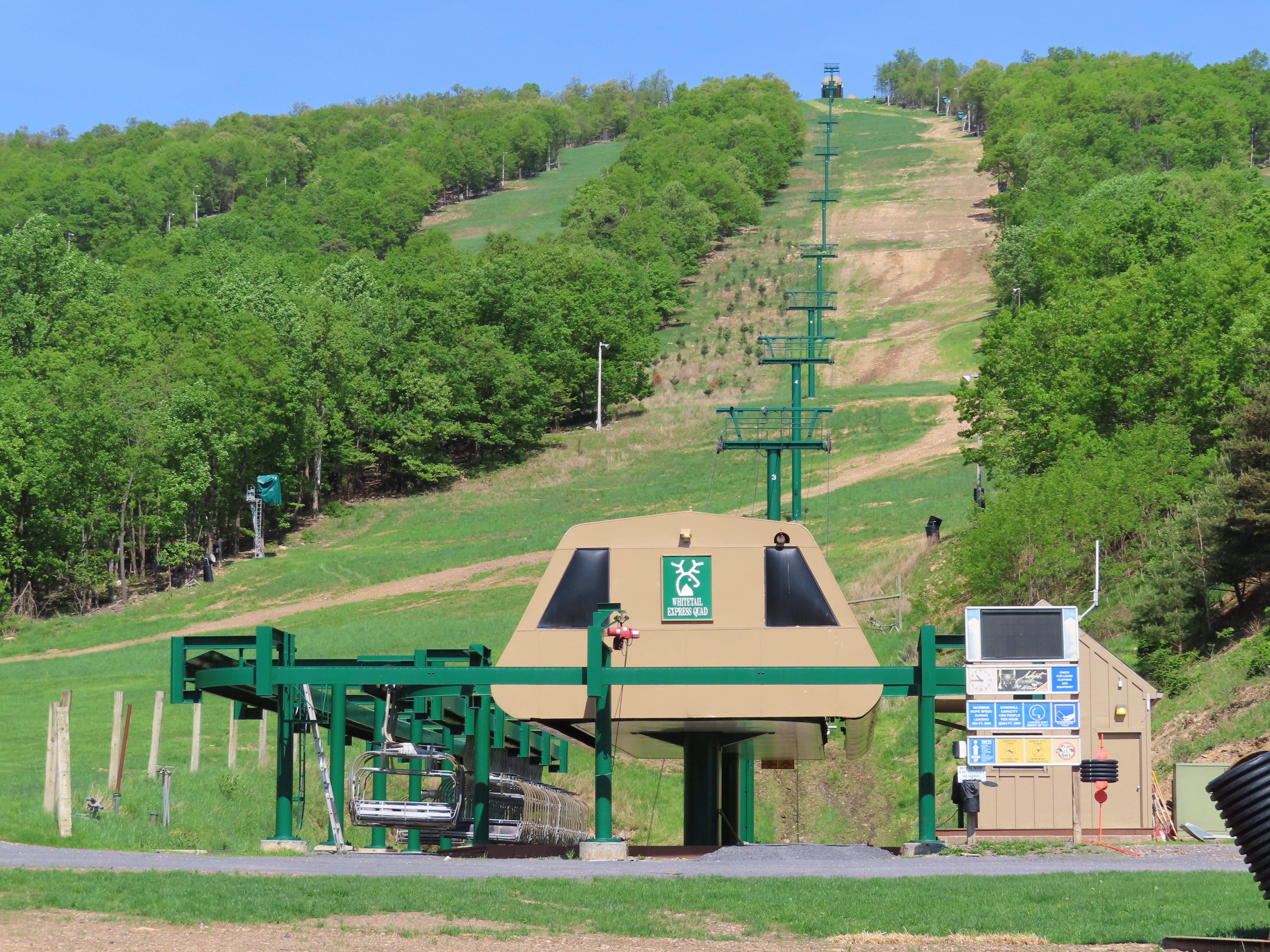
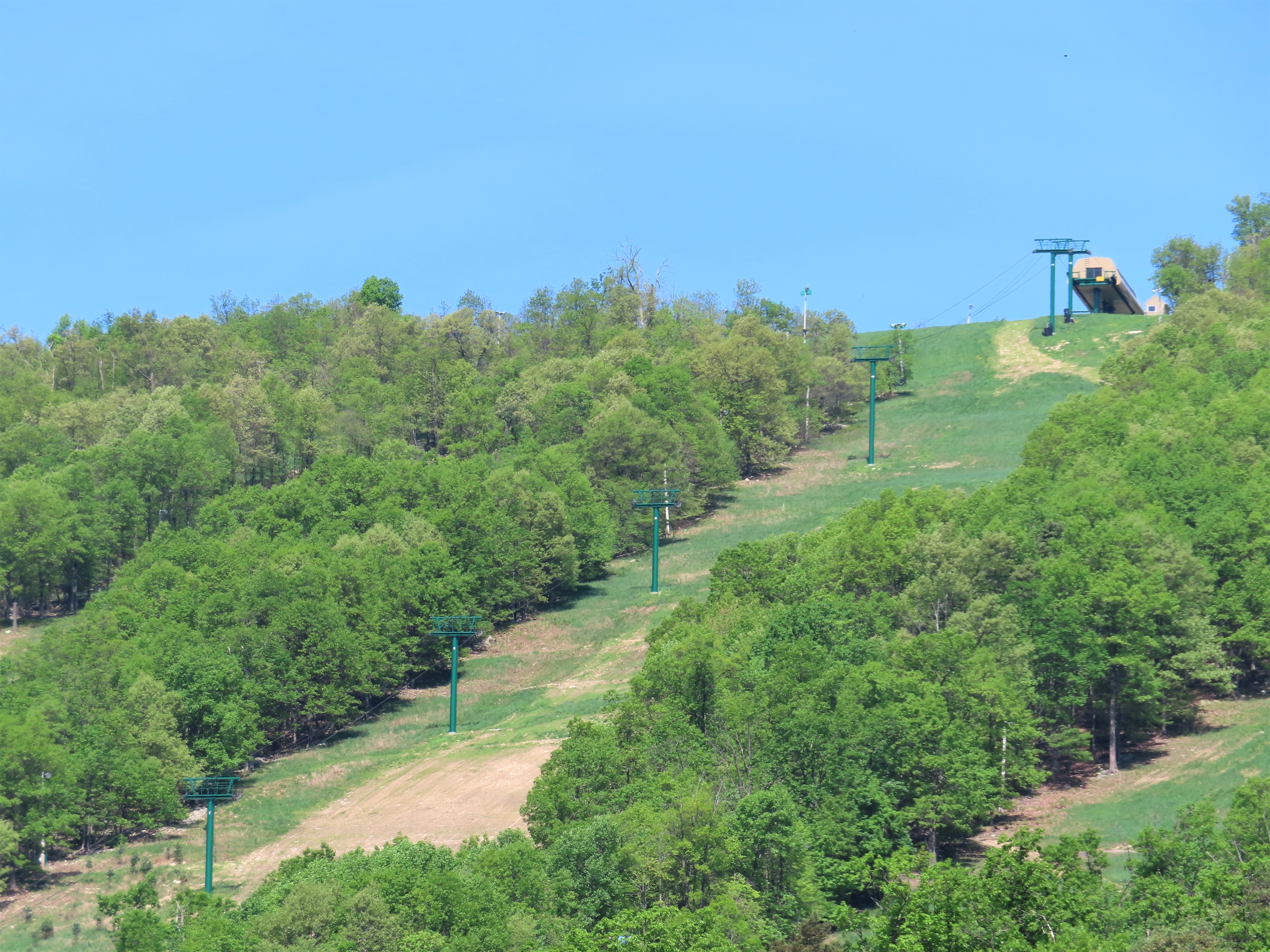
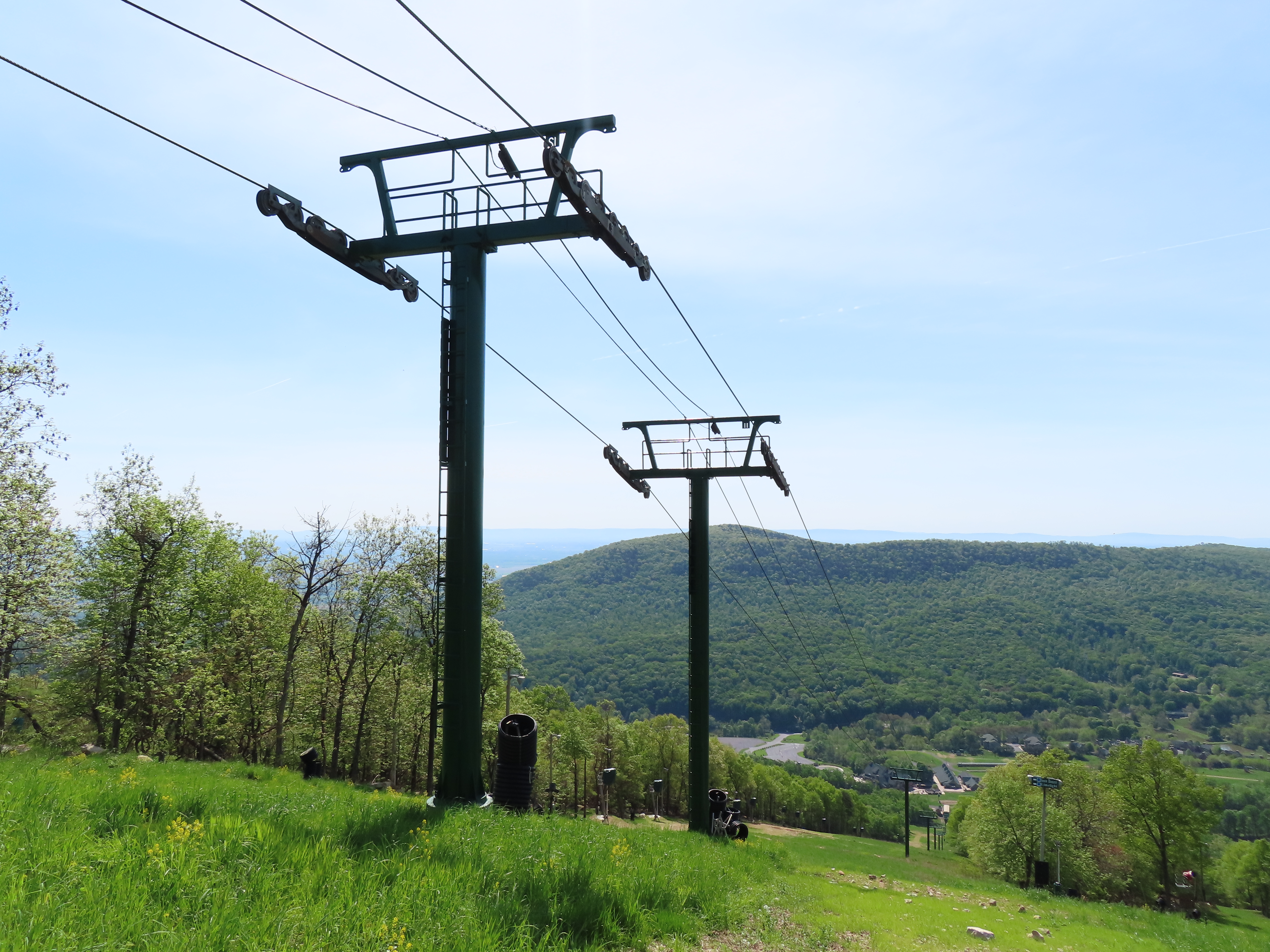
This lift was the first detachable in Pennslvania and only one for its first three seasons.The lift line with chairs removed for the summer.Interestingly, the chair rail is much longer than necessary to park all the carriers.Lift overview.The top terminal is the return.Small maintenance rail.Unloading area.Middle part of the line.The bottom terminal sits in front of the base lodge.Loading area and lift line.Upper lift line.Breakover towers 11 and 12.
As far as the ‘longer than needed maintenance rail’- I’d use all the space to spread the carriers out for summer inspection and I’d bet they do too. Much easier that way.
That’s just, like, your opinion, man. And if we learn anything from the comments on this here database, it’s that a) people don’t like to listen to people who know more than them, and b) people cannot agree on what “looks good” in lifts. For example, I personally am really digging how this lift’s colour scheme matches the terrain’s colour scheme. Lastly, lifts have multiple mandatory minimums that all cost money to design and matter more than Lift Blog Commenter æsthetics. If a lift is effective, efficient, and safe to ride, maintain, and operate, having an appealing appearance is just gravy. Really lastly, given that the perfect object–the SLI bale-style double chair–has already been designed, produced, and retired, paying attention to lift æsthetics at all is just a fool’s errand. Thank you and good day.

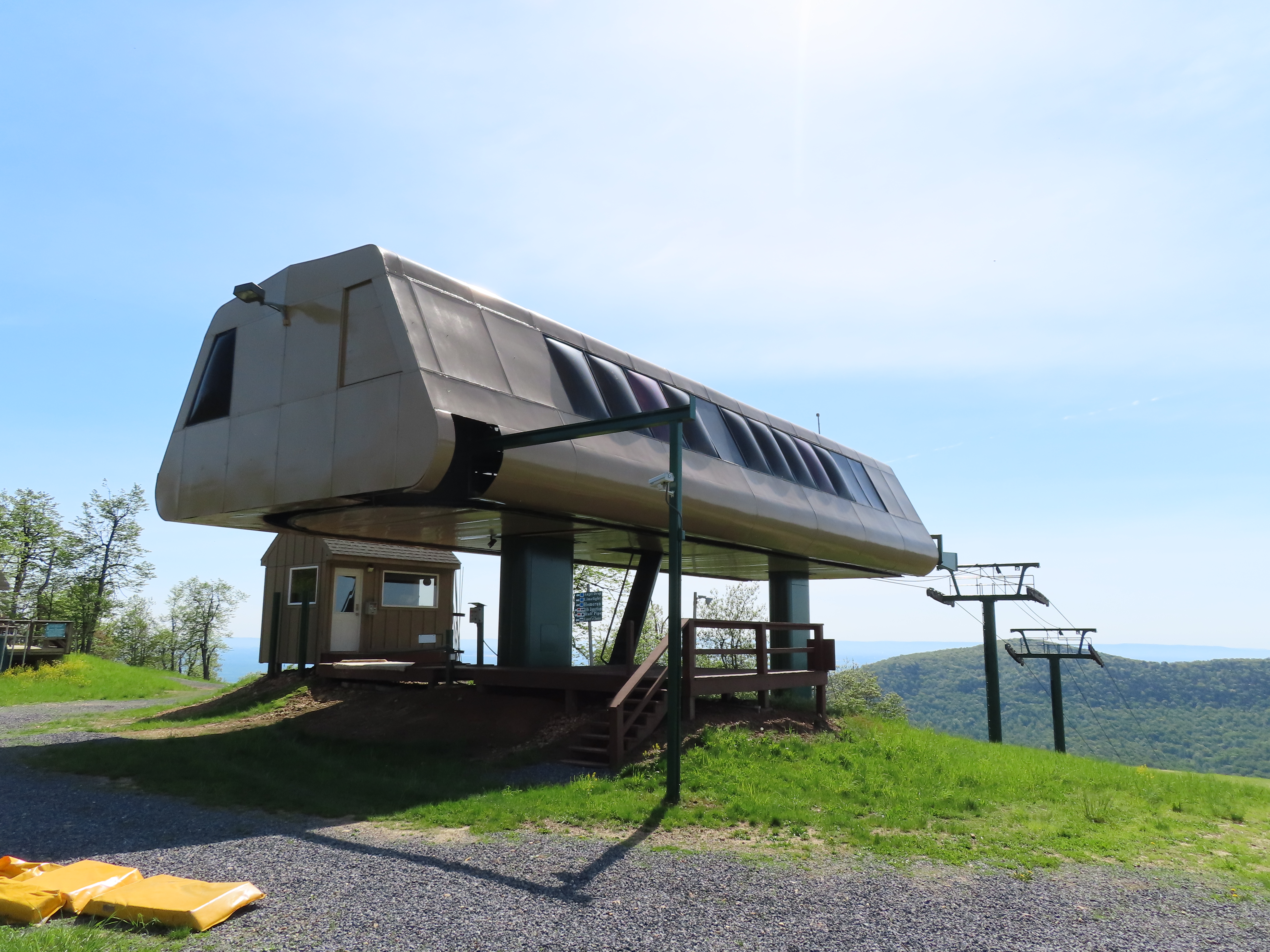
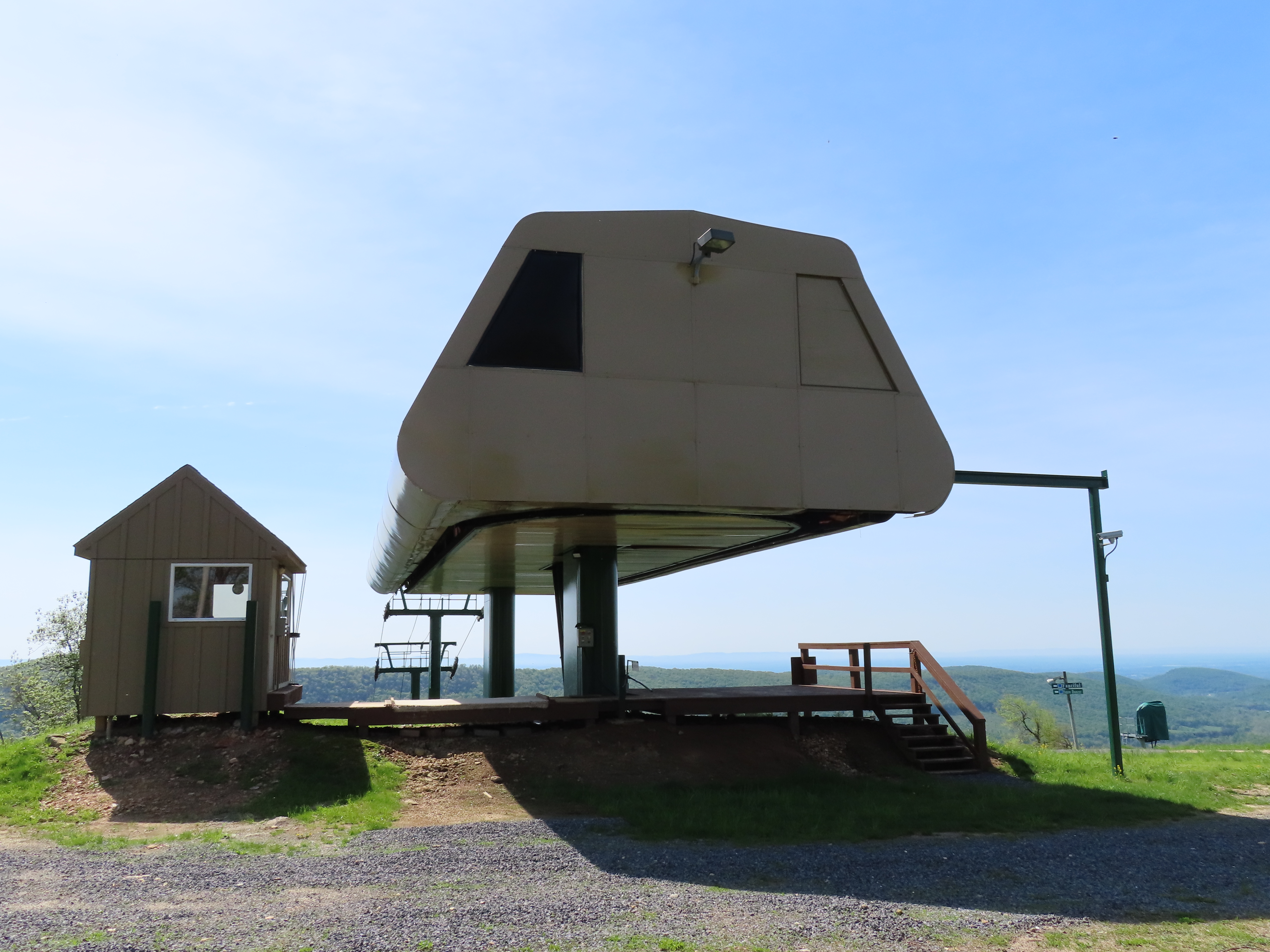

🤮 Those terminal skins make these the most hideous detachable terminals I have ever seen! What was CTEC thinking?!
The next detachable they built (also in partnership with Garaventa) looks to be the same mechanically but isn’t visually atrocious:
LikeLiked by 3 people
Corrugated sides and a different paint scheme would do the trick. Compare this to another CTEC high speed quad built the same year.
LikeLike
I actually disagree. I think they look WAY better than Great Western’s terminals, which look like a strip mall steakhouse circa 1983.
LikeLiked by 2 people
The terminals look so futuristic imo.
LikeLike
I think they’d look better if painted a different color, like the blue that Vail uses on their Garaventa CTEC high speed quads.
LikeLiked by 1 person
I think they look fine. They remind me of the classic BART cars in the bay area.
LikeLiked by 1 person
I can’t unsee that.
LikeLiked by 1 person
As far as the ‘longer than needed maintenance rail’- I’d use all the space to spread the carriers out for summer inspection and I’d bet they do too. Much easier that way.
LikeLike
I like the terminals.
LikeLike
Eeeeeew. That terminal skin is ugly as hell. Ski lifts should look good
LikeLike
That’s just, like, your opinion, man. And if we learn anything from the comments on this here database, it’s that a) people don’t like to listen to people who know more than them, and b) people cannot agree on what “looks good” in lifts. For example, I personally am really digging how this lift’s colour scheme matches the terrain’s colour scheme. Lastly, lifts have multiple mandatory minimums that all cost money to design and matter more than Lift Blog Commenter æsthetics. If a lift is effective, efficient, and safe to ride, maintain, and operate, having an appealing appearance is just gravy. Really lastly, given that the perfect object–the SLI bale-style double chair–has already been designed, produced, and retired, paying attention to lift æsthetics at all is just a fool’s errand. Thank you and good day.
LikeLiked by 2 people
The lift itself looks fine. It’s just the terminals color scheme. The color makes me think of vomit.
LikeLike
This lift seems really old. I hope they don’t downgrade to a fixed grip because this mountain is crowded enough as is.
LikeLike