At an event this afternoon, Vail Resorts officially launched the brand for America’s new largest ski resort. The new Park City logo combines the Canyons infinity symbol with a new Park City red color and the tagline “There is Only One.” This is not terribly surprising from a company whose flagship resort is branded “Like Nothing on Earth.” CanyonsResort.com now redirects to the new Park City website, which ironically is the old Canyons site. No doubt the new logo and colors look sharp and will serve them well for years to come. Many of the lifts have already been repainted in the new red and silver color scheme in preparation for this winter.
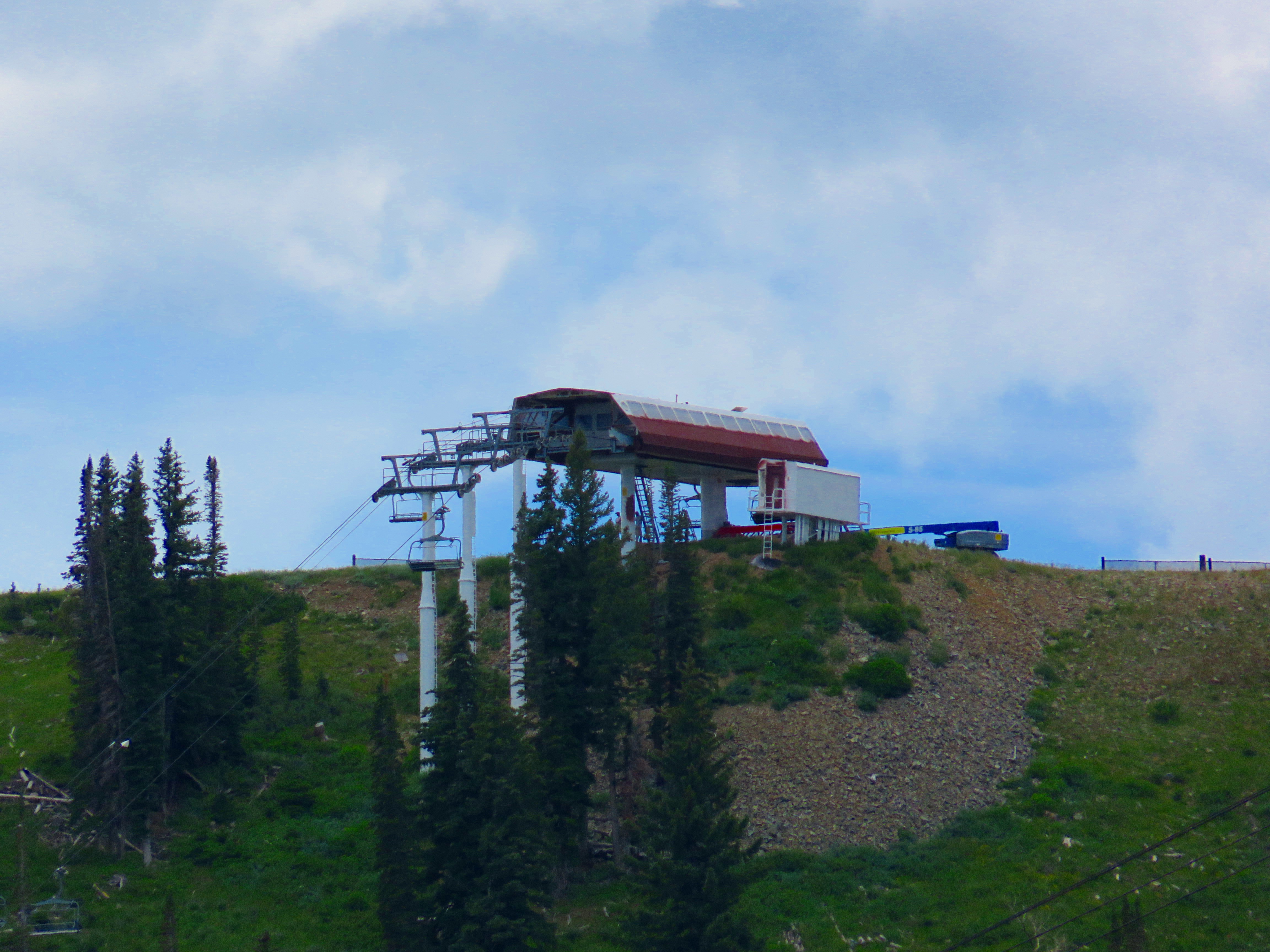
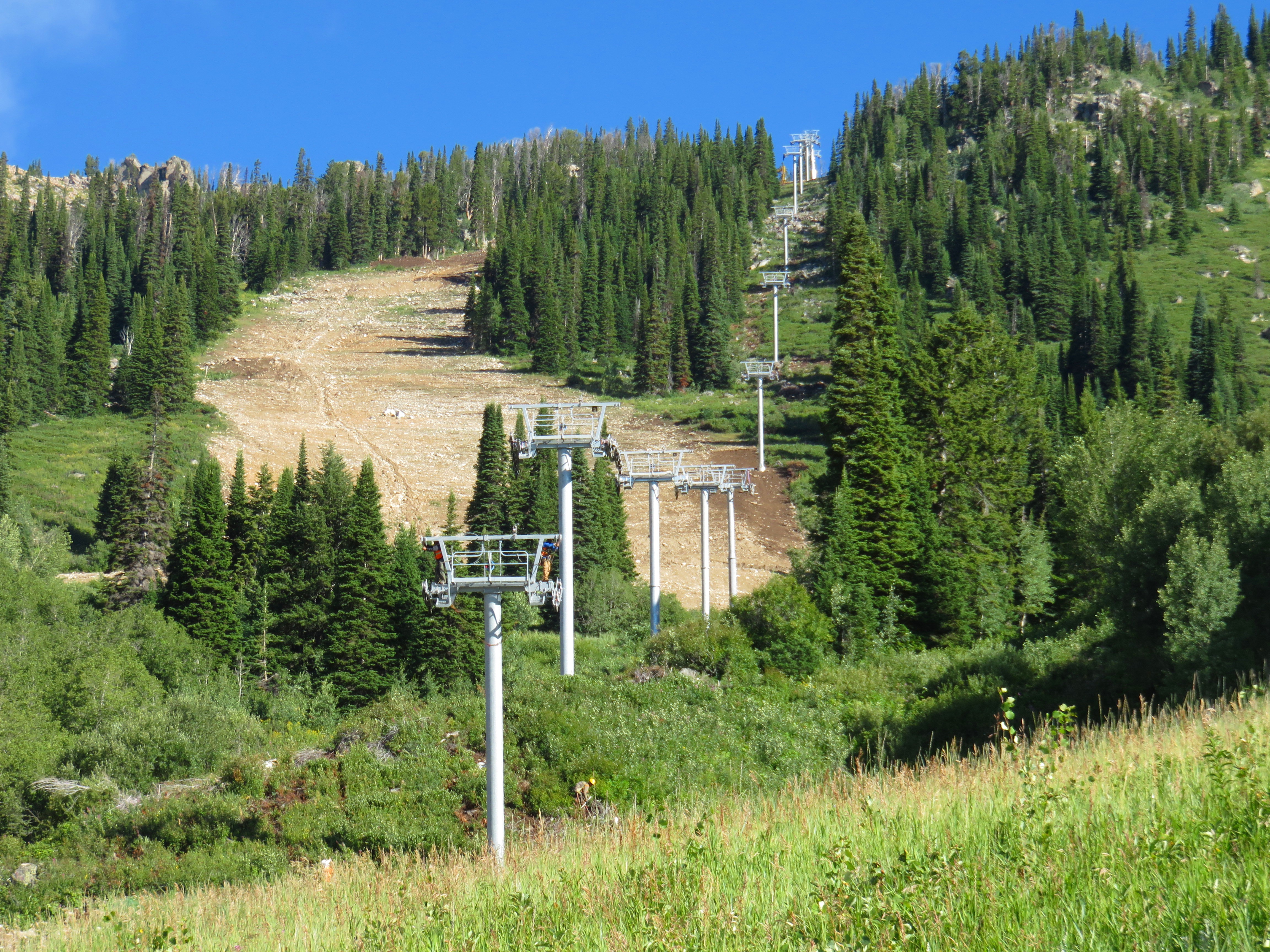
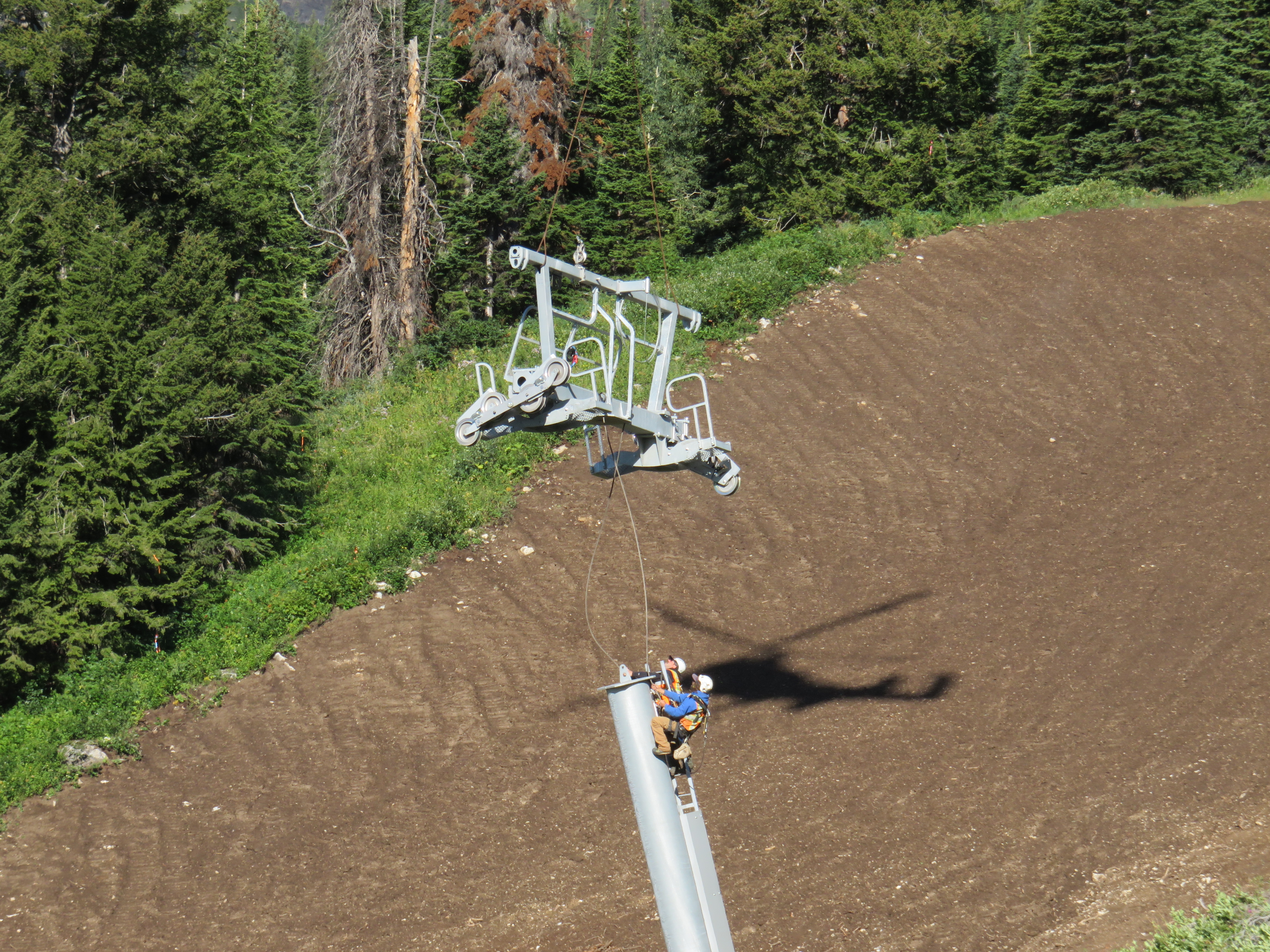
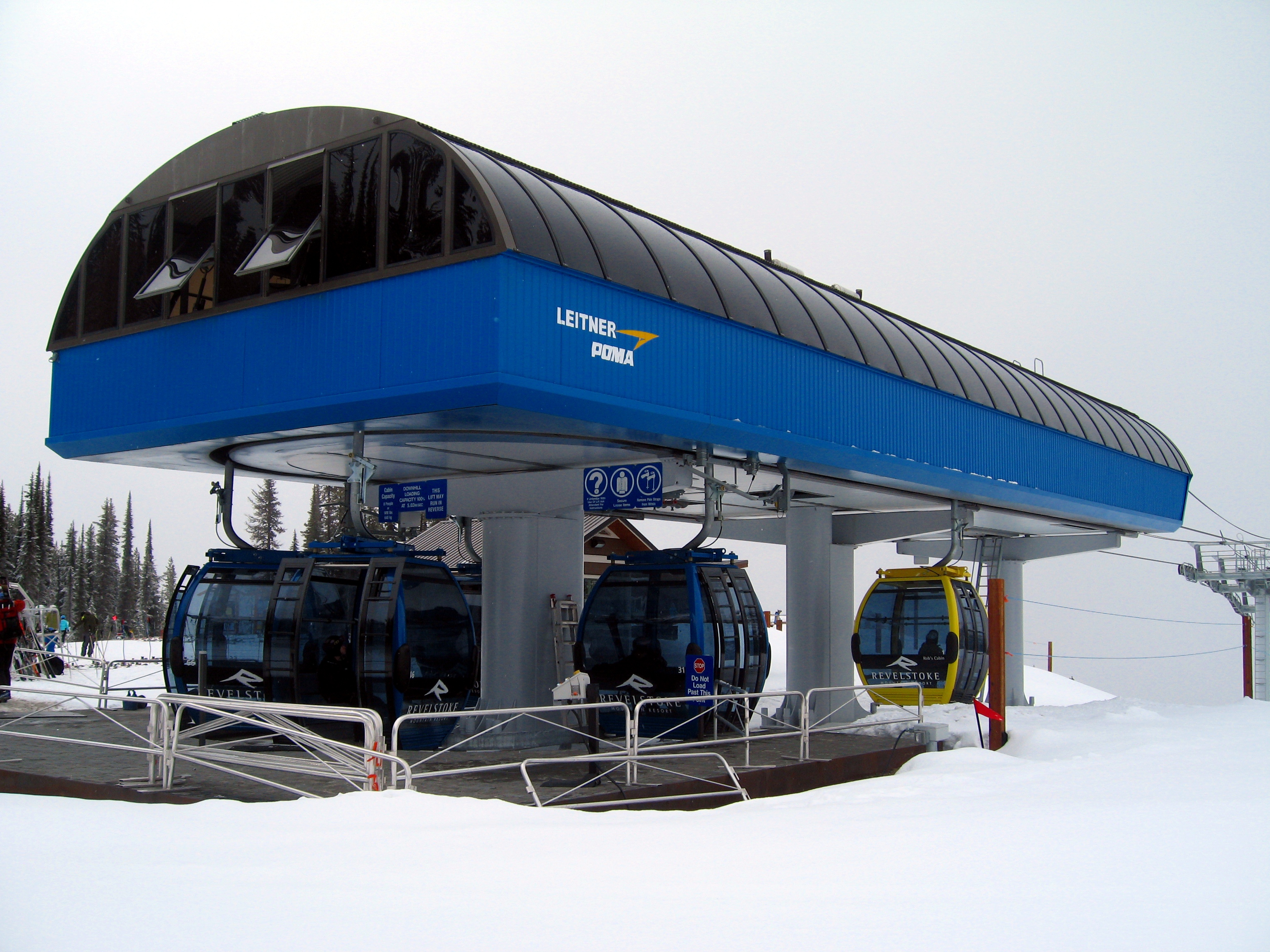
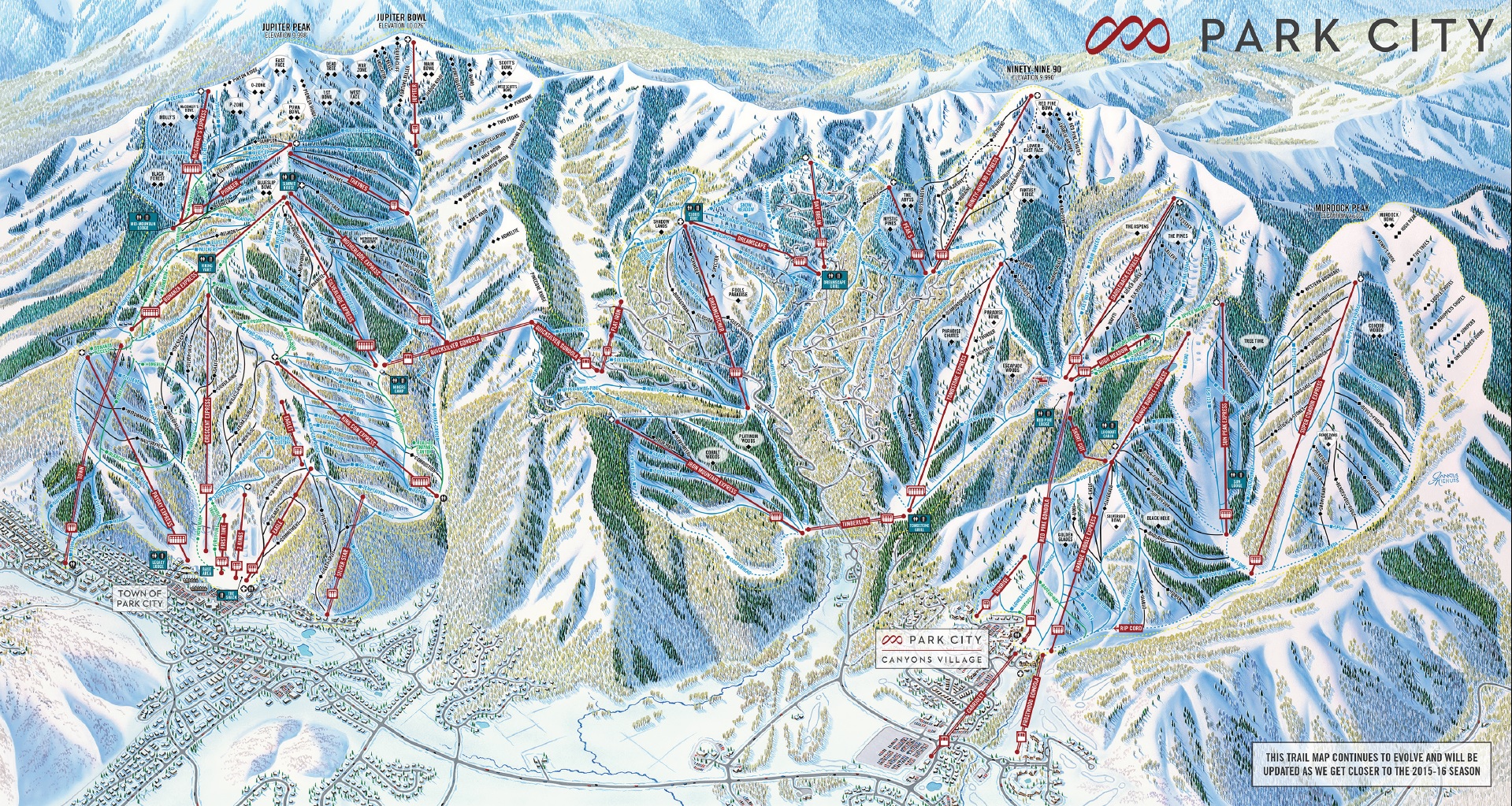
Also unveiled today was a new trail map painted by James Niehues. The working name for the new gondola (Pinecone Gondola) has been scrapped in favor of Quicksilver Gondola in an ode to Park City’s mining heritage. I liked the Pinecone name; it was chosen for the ridge the gondola crosses but I imagine Vail was worried about confusion with the existing Red Pine Gondola. Quicksilver fits well with the mining names already in use at Park City such as Silverlode, Bonanza, Motherlode and Payday. The new lodge at the base of the Quicksilver Gondola will be called Miner’s Camp. Although it has mostly disappeared, the Canyons name lives on as the northern base area has been renamed Canyons Village.